


G4S JAVELIN
UX/UI Project

With bluechip clients paying G4S millions for data-driven security services, G4S knew their patchwork of inherited semi-functional customer portals didn’t reflect the kind of service and quality these clients expected.
Summary
GOING WHERE NO DESIGNER HAD GONE BEFORE
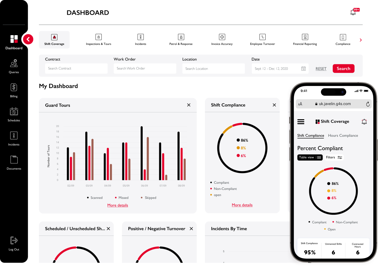
G4S, a client who I’d worked with on several other projects, approached us to redesign the client-facing portion of their bespoke data-driven all-in-one system, Javelin. Unfortunately, Javelin had been rushed into production and the lack of design thinking was very apparent.
Keen not to repeat their mistakes, we made sure to lead a discovery phase that shone a light on what worked and what didn’t. Design thinking was still new to G4S, so we had to guide them through the process, but the work we did allowed us to design a portal with an enjoyable user experience that met their clients high expectations.
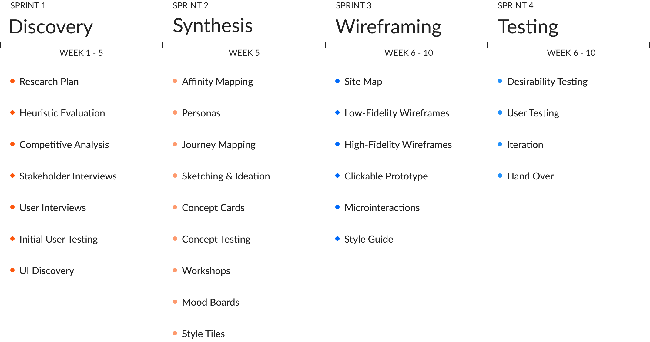
The project took 10 weeks and was followed by a development phase where I worked with the client and developers in Ukraine and India throughout the build process.
PROJECT TIMELINE
Aug - Oct 2020
ROLE + RESPONSIBILITY
Project Lead — owned the end-to-end UX process, from research and synthesis through to prototyping, dev handover and build oversight
TEAM + TOOLS
cross-functional agency team (UX, UI, 2x PM)
FIGMA | MIRO
THE problem
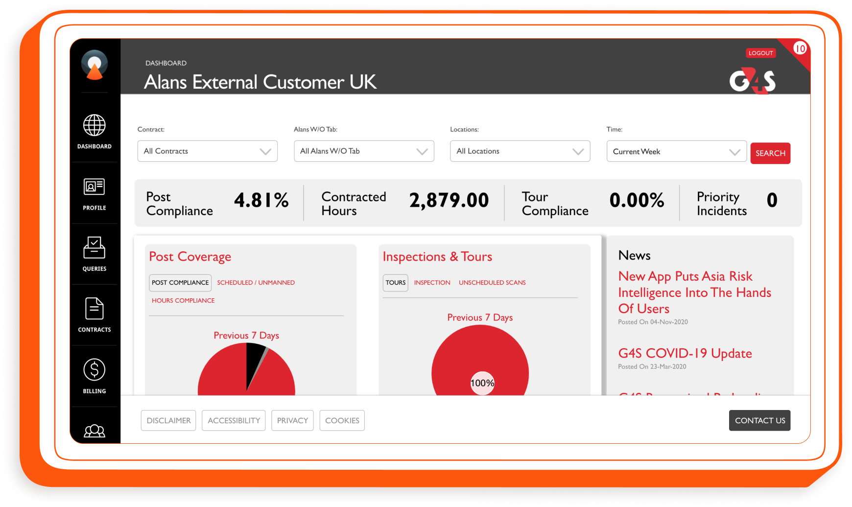
An amalgam of mergers and regional subsidiaries, G4S naturally inherited a lot of disparate legacy tech, which seldom interoperated, as it grew. And for a multinational data-driven security company, this was a big problem. Enter their silver bullet solution - Javelin. Needless to say, Javelin failed to hit the mark, at least for the customer-facing portion, which was used by only a handful of users, had serious reliability issues and was rushed into production without any design thinking and built by an inexperienced team. Our job was to fix the portal.
The Solution
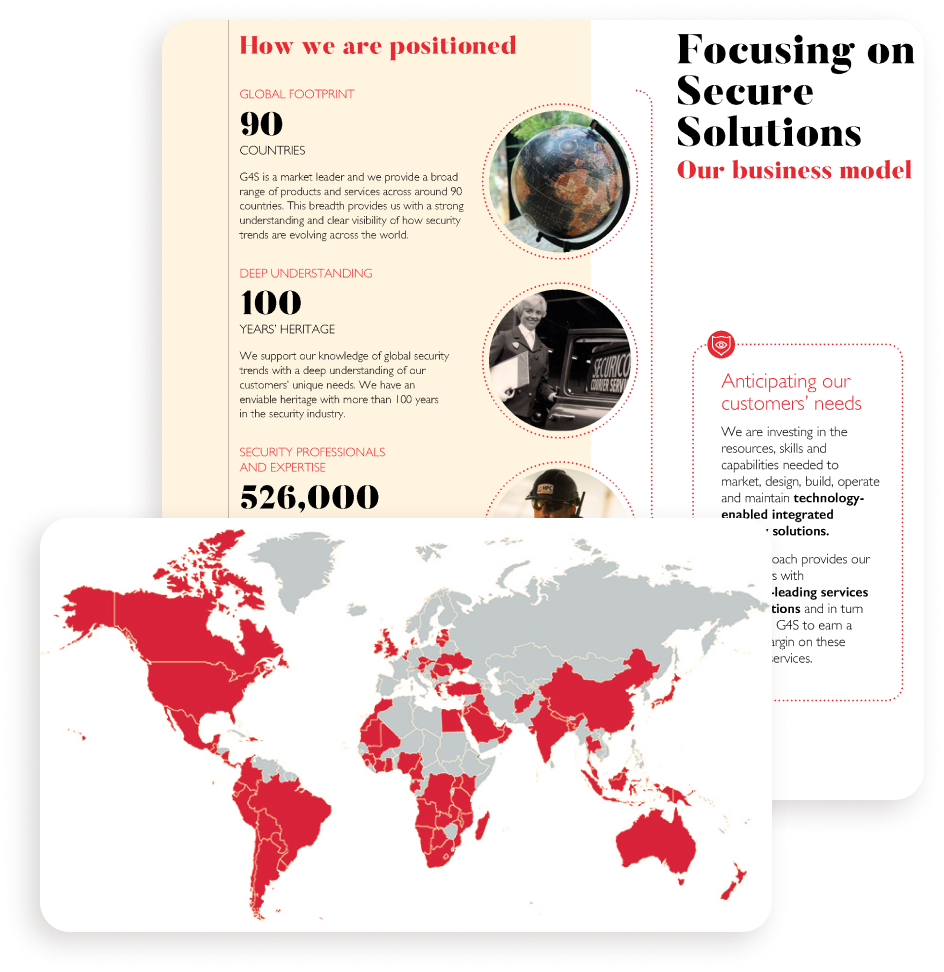
Due to the size and scale of G4S, a company that operates in 90 countries each with its own set of needs, Javelin has a lot of stakeholders and would-be users to consider. This meant we spent a lot of time gathering information, which at points felt overwhelming as the project scope seemed to increase at an exponential rate. With two project managers and strict Agile discipline, however, we stuck to our plan for phase 1 - to deliver an MVP.
Discovery
MANAGING EXPECTATIONS
Having just worked with G4S PLC before, I hadn’t encountered what would become our biggest challenge early on in this project, the independence of G4S’s myriad subsidiaries.
Different branches tended not to talk to one another, with different needs and expectations creating a kaleidoscope of perspectives for us to tap into and unpack. Then there were the clients.
From Cisco to Facebook, EDF to DPD the clients were as diverse as their needs and goals. It was all good information, but we quickly tightened our questions to get the info we needed and to manage expectations.
STICKING TO THE MVP
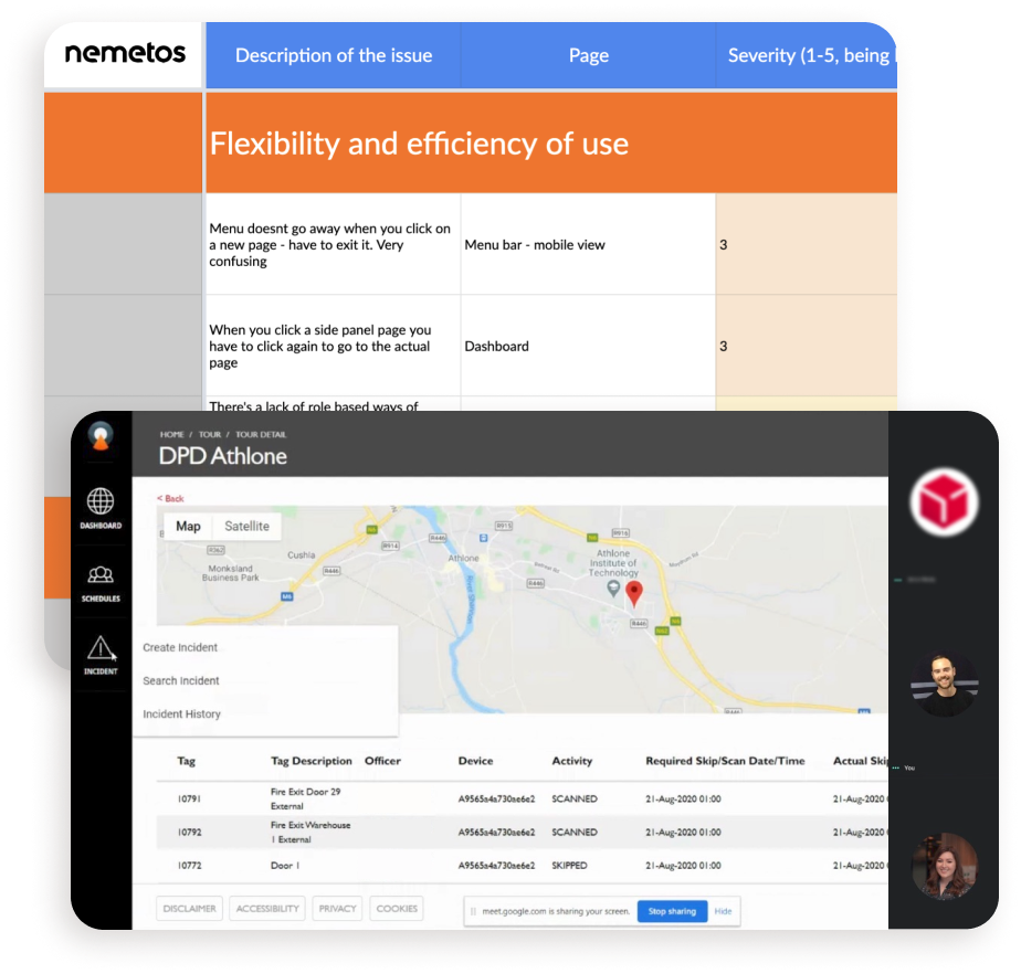
As an external agency we were unfettered by internal politics and able to ask all the hard questions, meaning we learned things that challenged our client’s initial assumptions about Javelin, G4S and their clients.
Aside from interviews, we conducted desk-based research and user testing of the existing solution, which pointed to major deficiencies in its usability and design - not to mention how Javelin measured up to its competition.
It became very clear that whilst new features would be desirable, there was a lot to fix for the MVP to be usable. In fact, most of what we learnt would have to implemented in the later planned phases.
For now, we had to create a robust, pleasing user experience to justify the funding for the next phases, allocated at G4S’s next annual review.
Synthesis
UNTYING THE GORDIAN KNOT
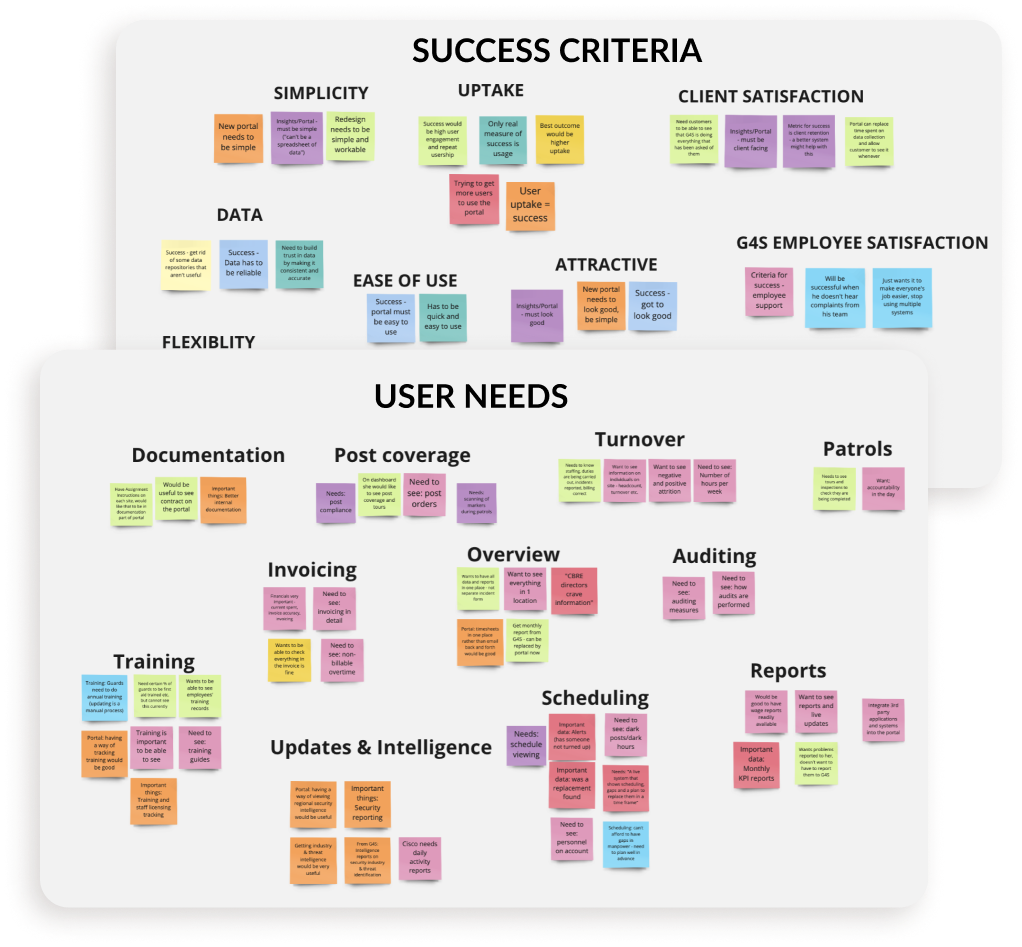
Like most other projects during 2020, we worked entirely remotely. So, to synthesise our data we used Miro, unpacking our findings and identifying some interesting trends.
Since G4S was so new to design thinking we also took the opportunity to involve them via a couple of workshops. This meant they felt invested and could see what we were doing and the value of our work.
On the whole, customers wanted a robust, streamlined portal. Interestingly though, data on staff training, intel reports and wage data were all in high demand - details that would become the scope for the next phases.
G4S USER HIGHLIGHTS
76%
OF USERS needed to prove g4s met their quotas
83%
OF USERS WANTED TRAINING, WAGES AND INTEL IN JAVELIN
89%
OF USERS NEEDED RELIABLE ACCESS TO STAFF SCHEDULES
96%
OF USERS WANTED TO see data relevant to them
Personas
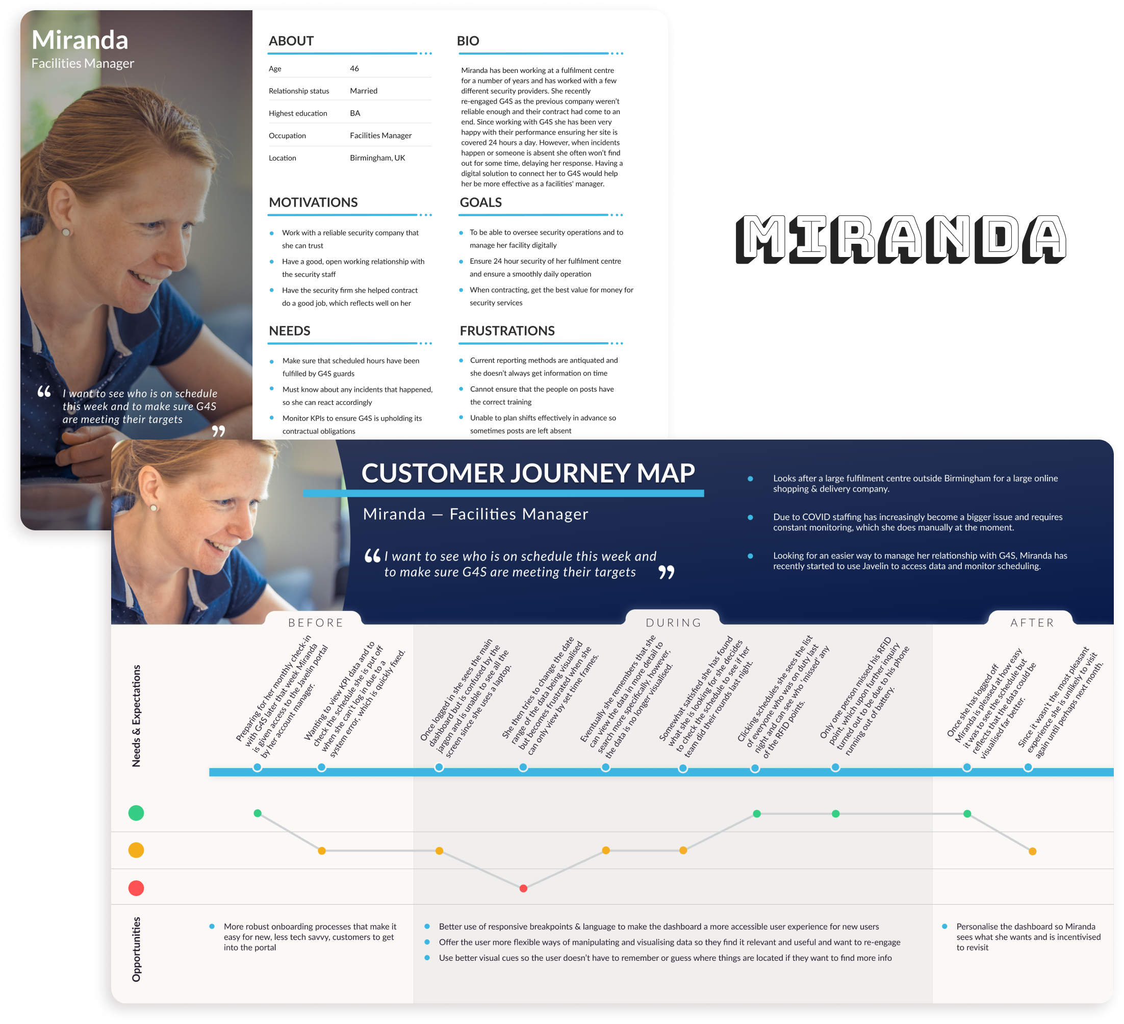
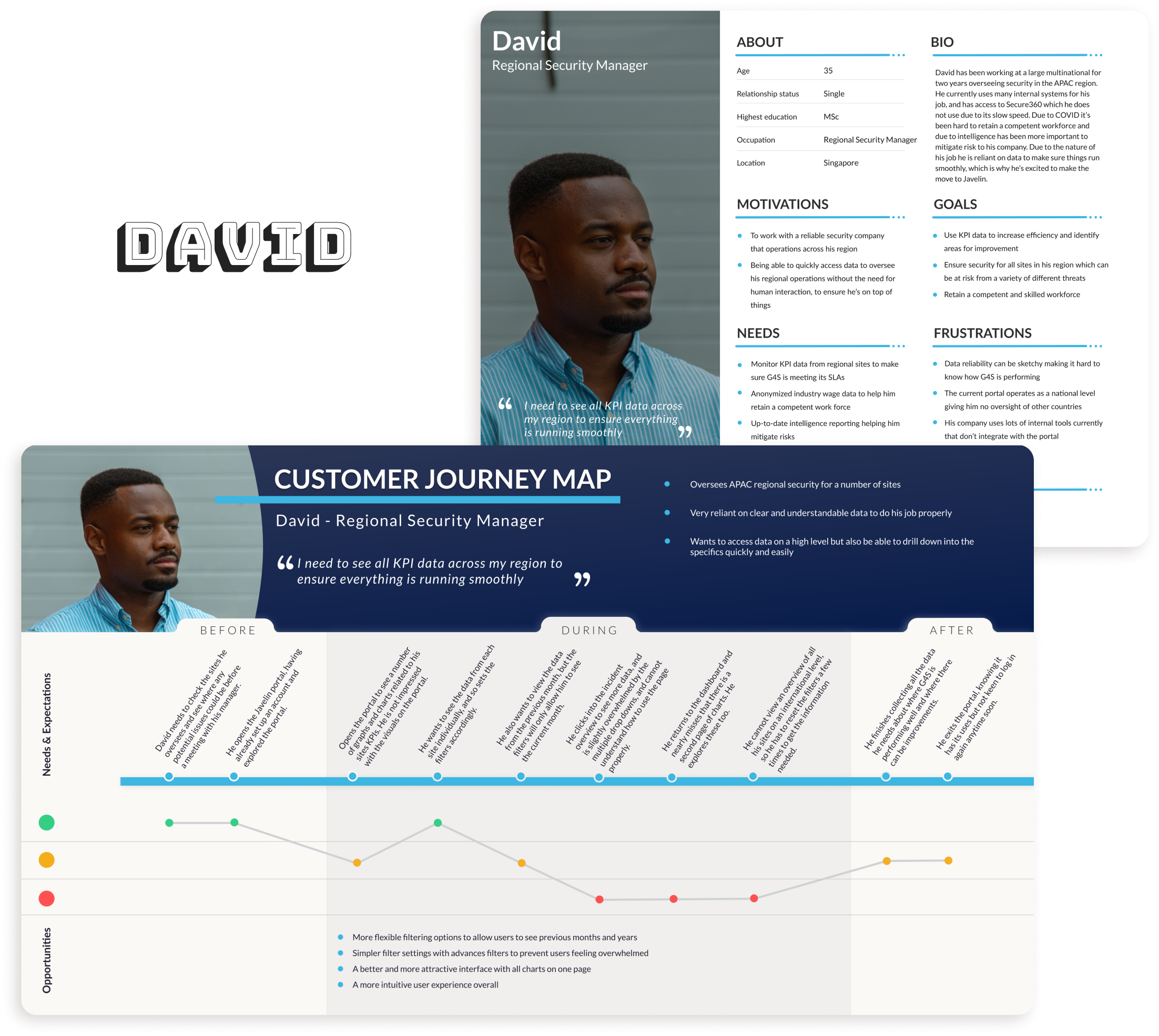
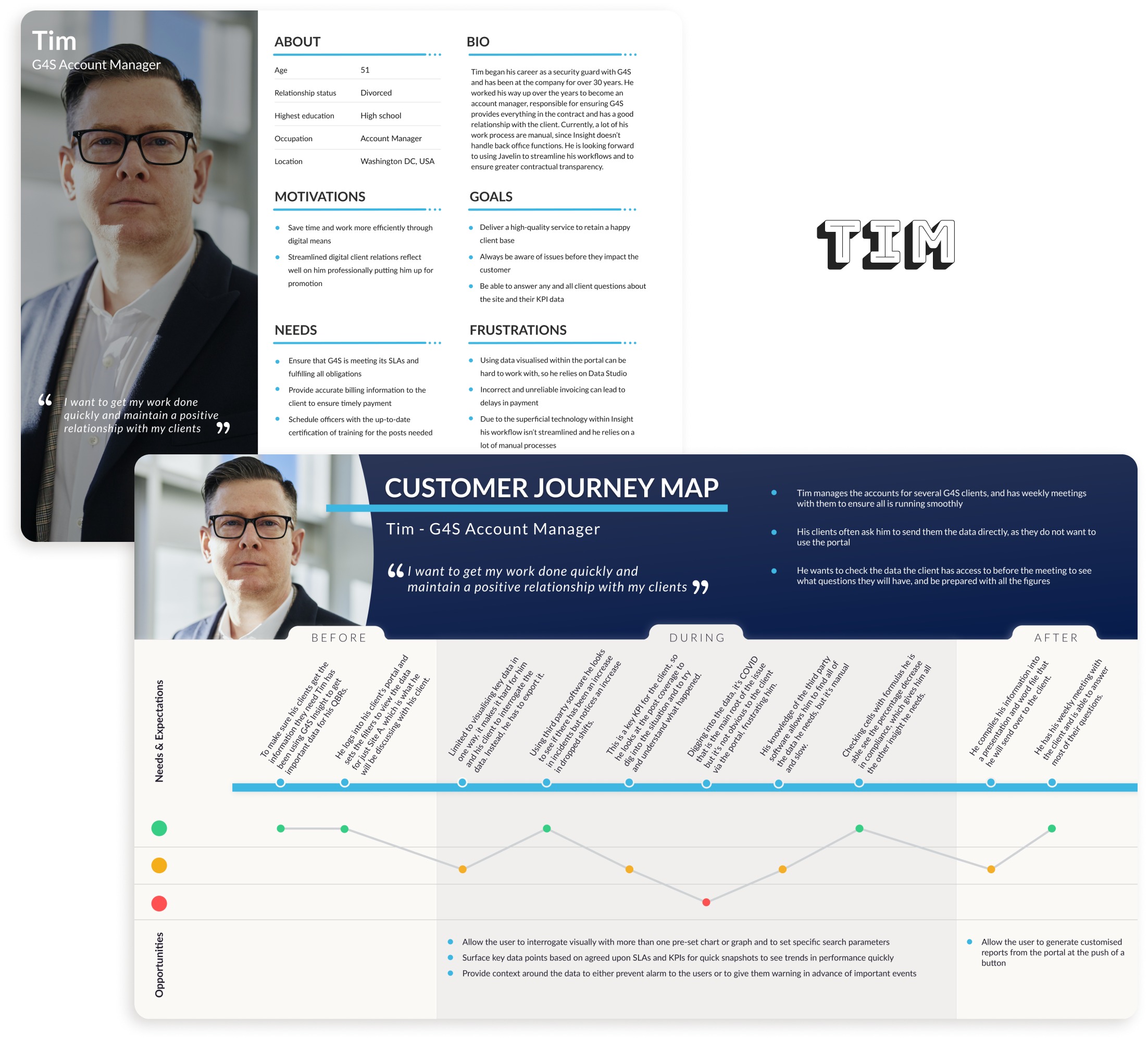
Thanks to our workshops and the frequent sprint meetings, my team and the client were on the same page. However, since the existing journey flows in Javelin were going to be transformed quite radically we took the time to create three personas and journey flows, which became an important stake in the ground for justifying certain features. Plus we wanted to capture the diversity of the users we had spoken to and their unique perspectives on the Javelin solution.
Ideation
STORMING OUR BRAINS
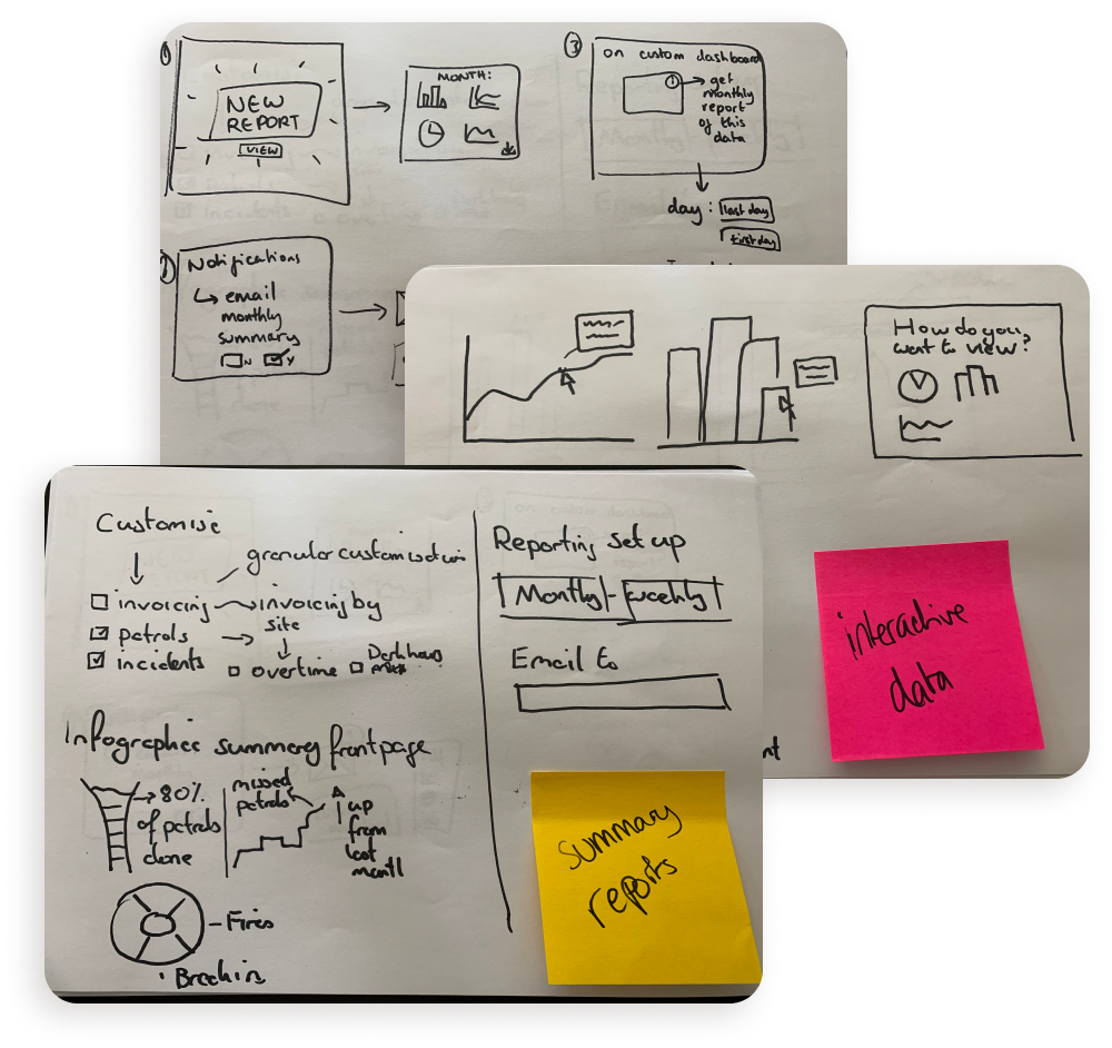
Aside from the existing features we needed to overhaul or remove, we also wanted to come up with some ideas for improving the Javelin MVP based on user feedback.
After running several 6-8-5 exercises and developing our concepts we ran another workshop with the client. We used this opportunity to get buy-in and to glean some feedback to help us prioritise what to design.
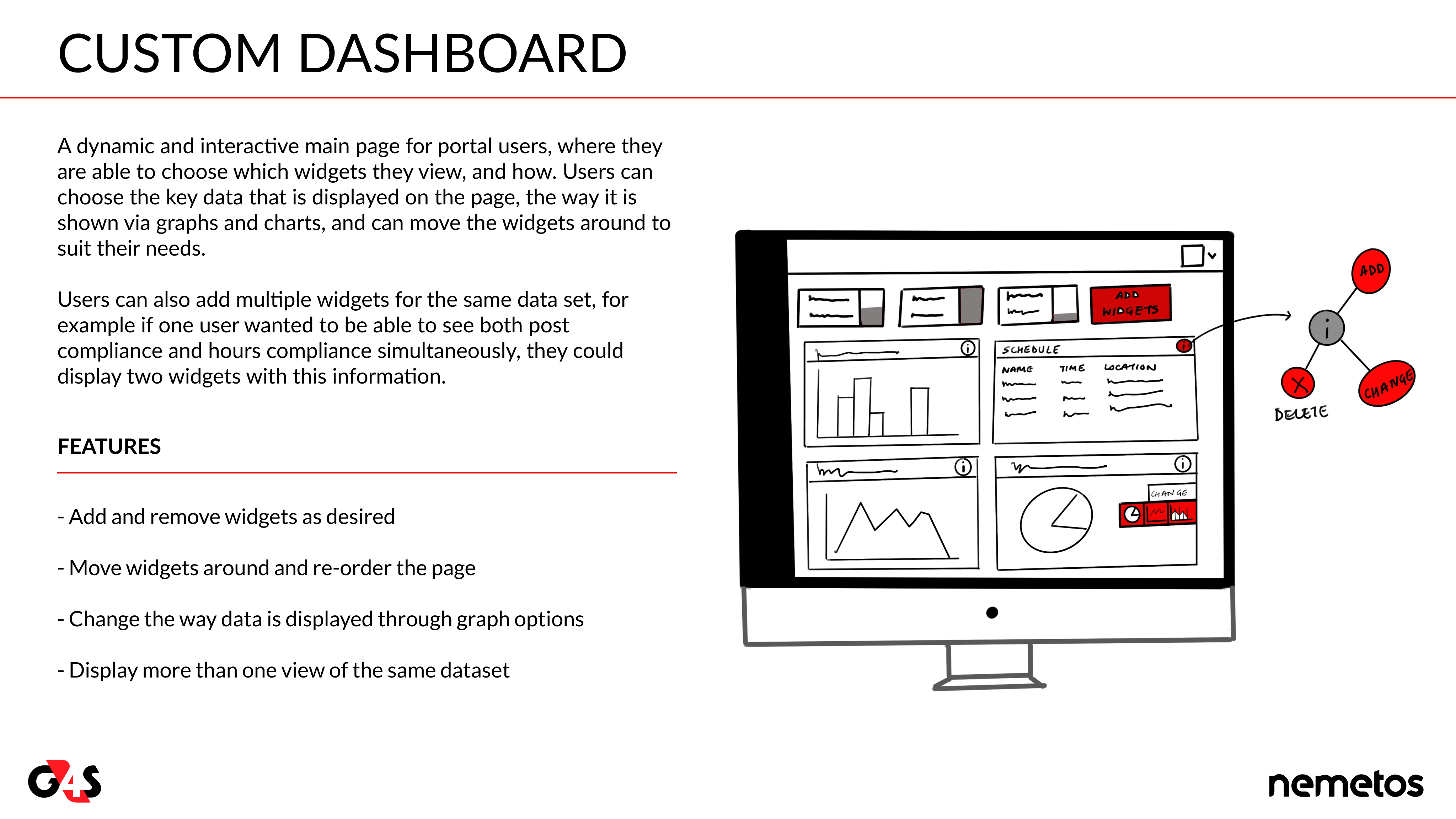
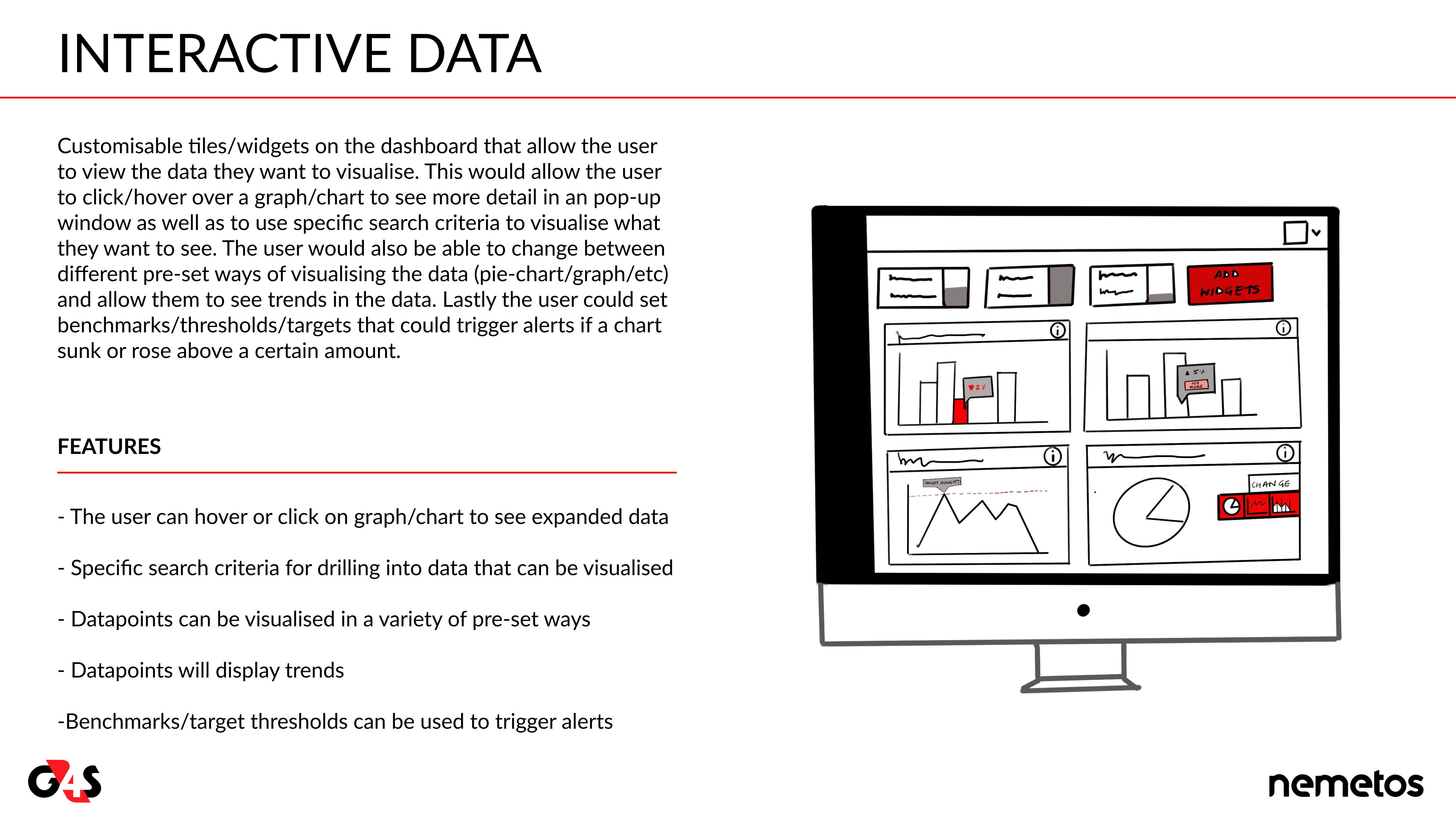
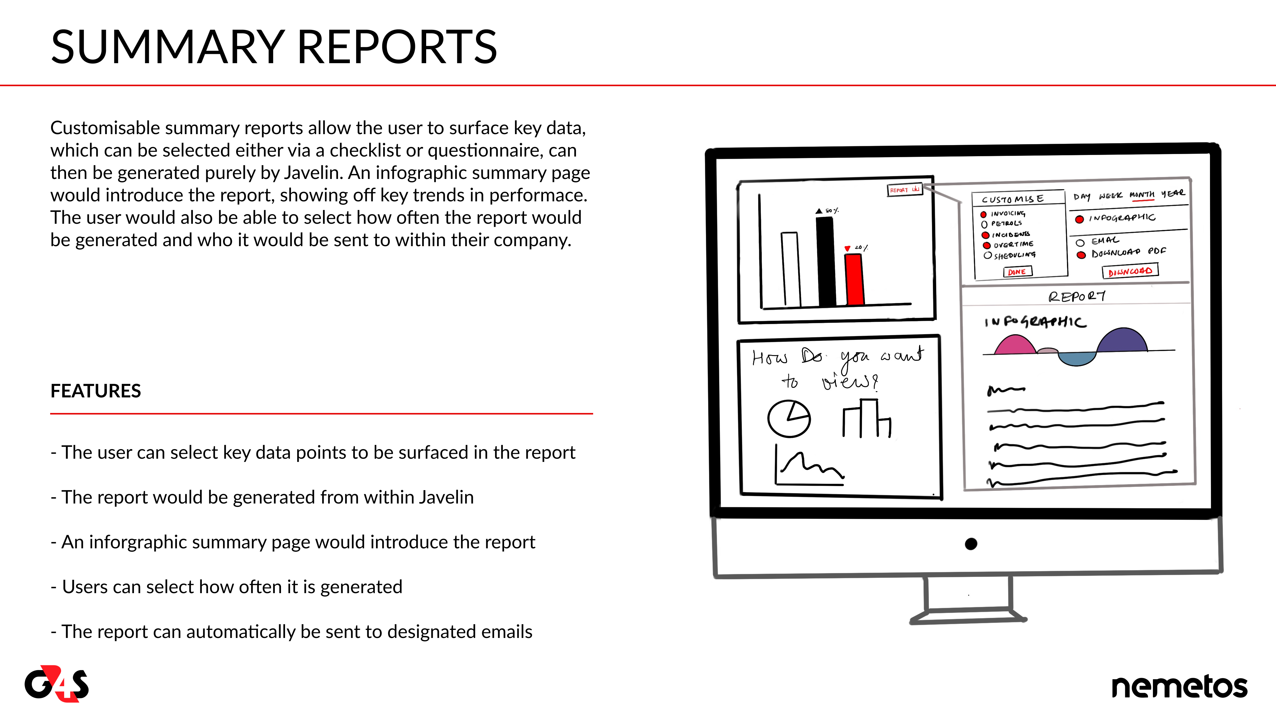
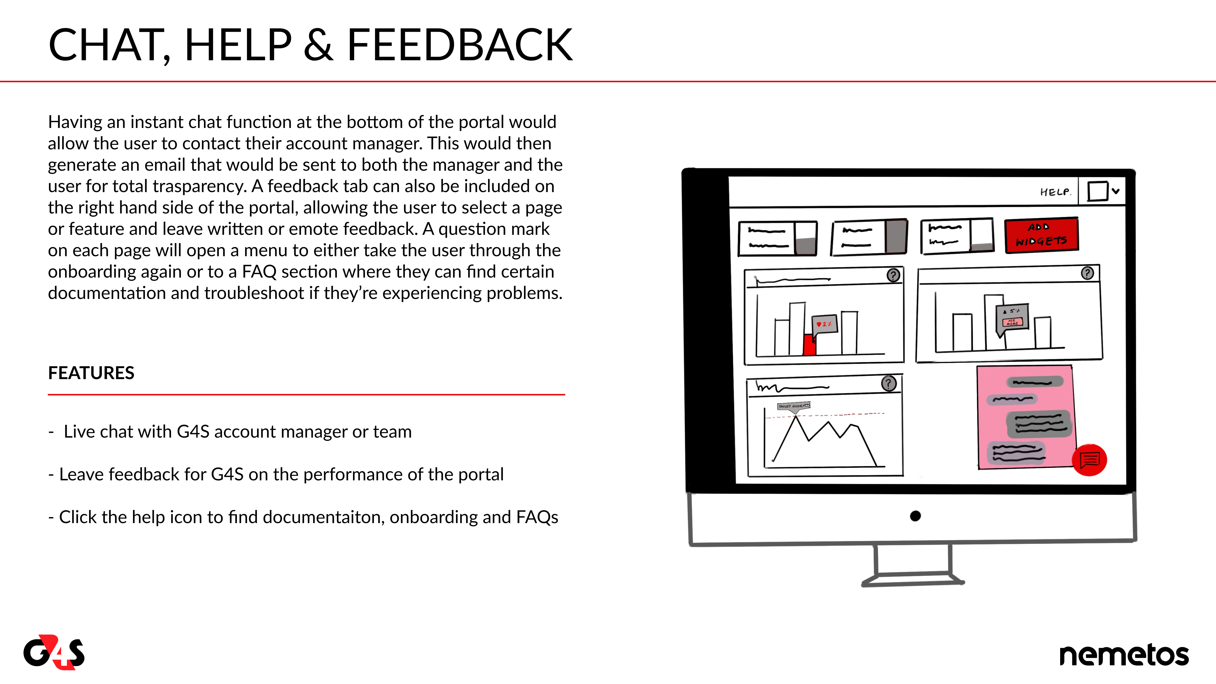
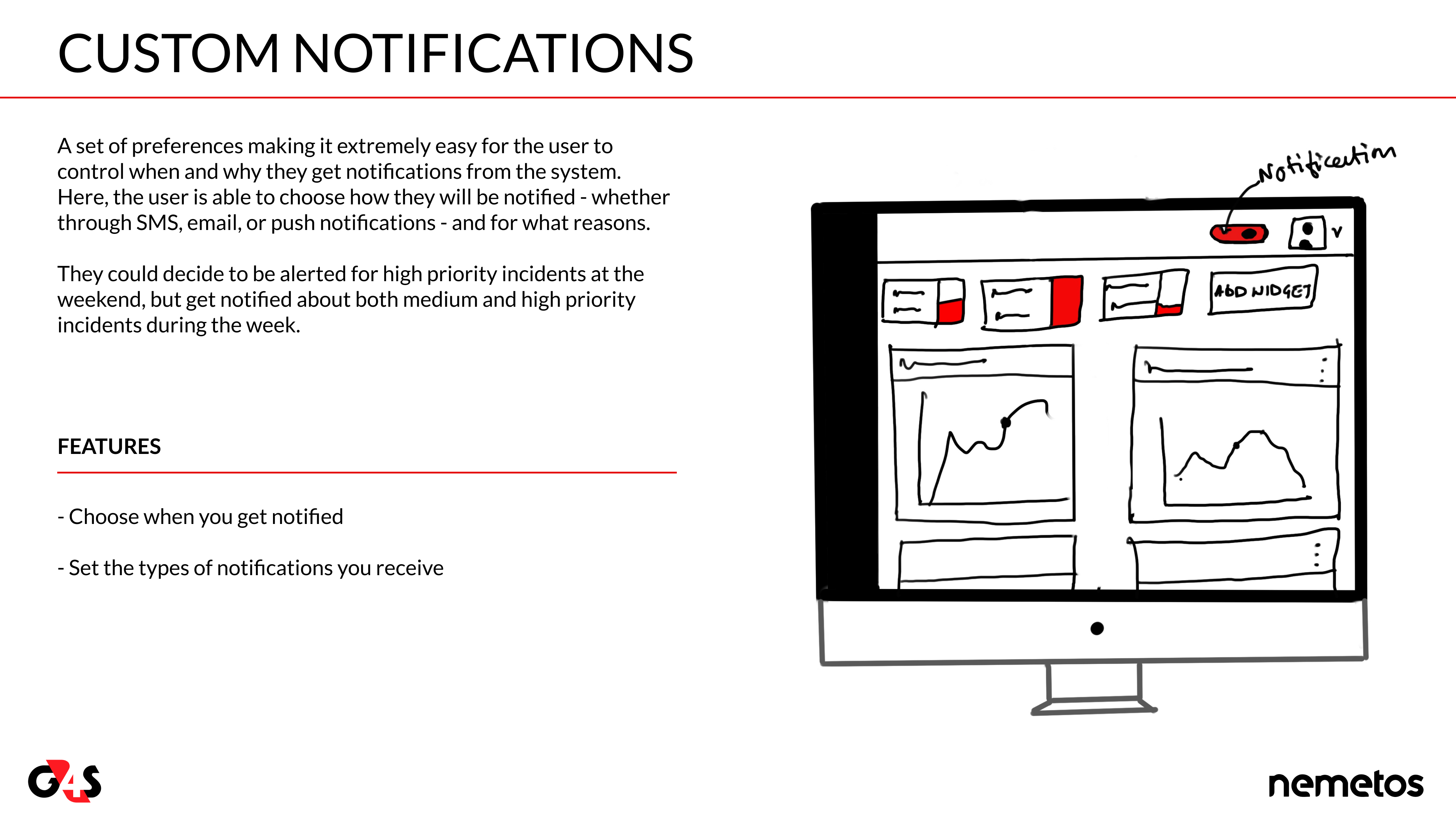
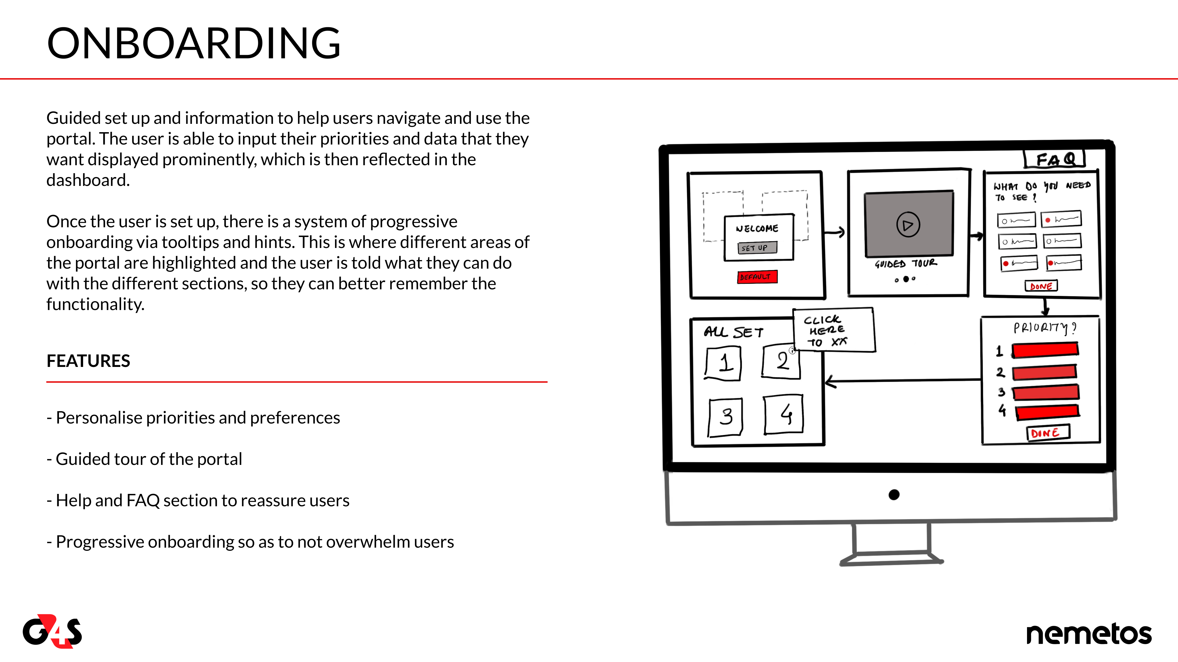
The six concepts cards we presented were ranked, based on our user data, and then voted on by the client, based on feasibility. It was a great exercise with us getting greenlit for two and shelving four for the next phase.
CONCEPT CARDS
1ST
2ND
3RD
4TH
5TH
6TH
Wireframing
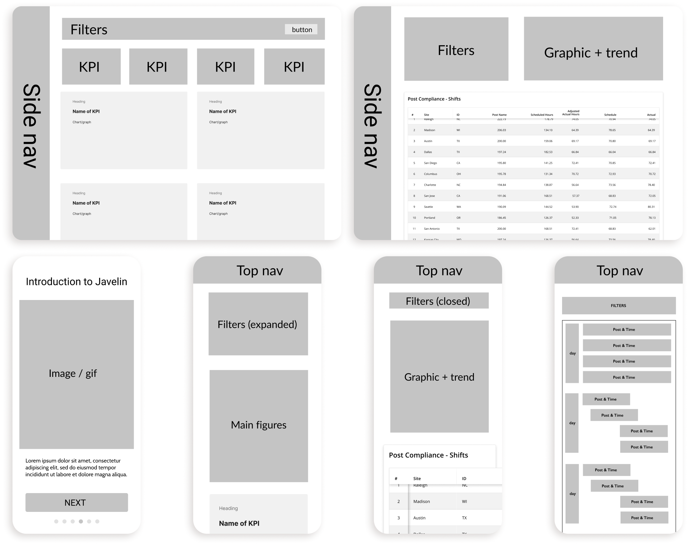
To ensure we were on the right track we needed to flesh these concepts out into low-fidelity designs for testing. Although very rough, these wireframes allowed our users to experience some of the user flows we had mapped, highlighting some problems with the information architecture that took quite a long time, testing and iterations to solve. Thanks to the UI team we were able to skip the mid-fidelity wireframes and launch into high-fidelity designs.
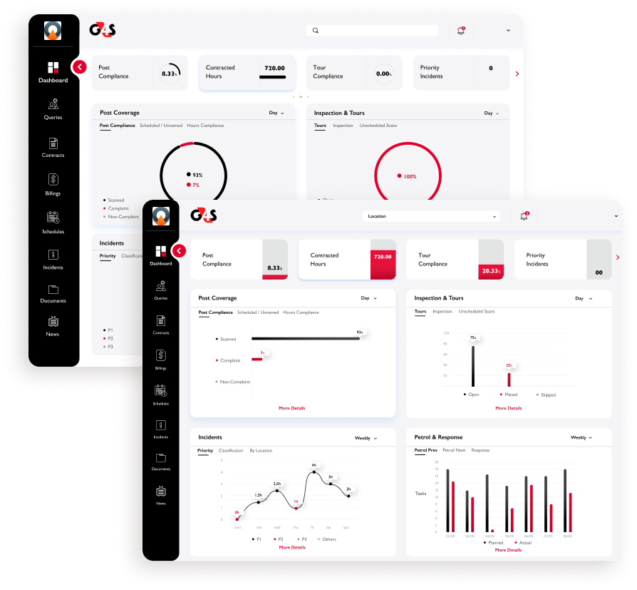
MOODBOARDS, STYLE TILES & HI-FI
It was now that the UI team kicked into full gear, initially developing mood boards for the new look and feel of Javelin drawing on the work they had done during their visual discovery.
Using a ‘gut test’ they identified which designs were most desirable with the client before then developing some style tiles that went on to become Javelin’s new aesthetic.
With the UI team working in tandem, they started creating the high fidelity designs and later the prototype and micro-interactions.
Testing & iterating
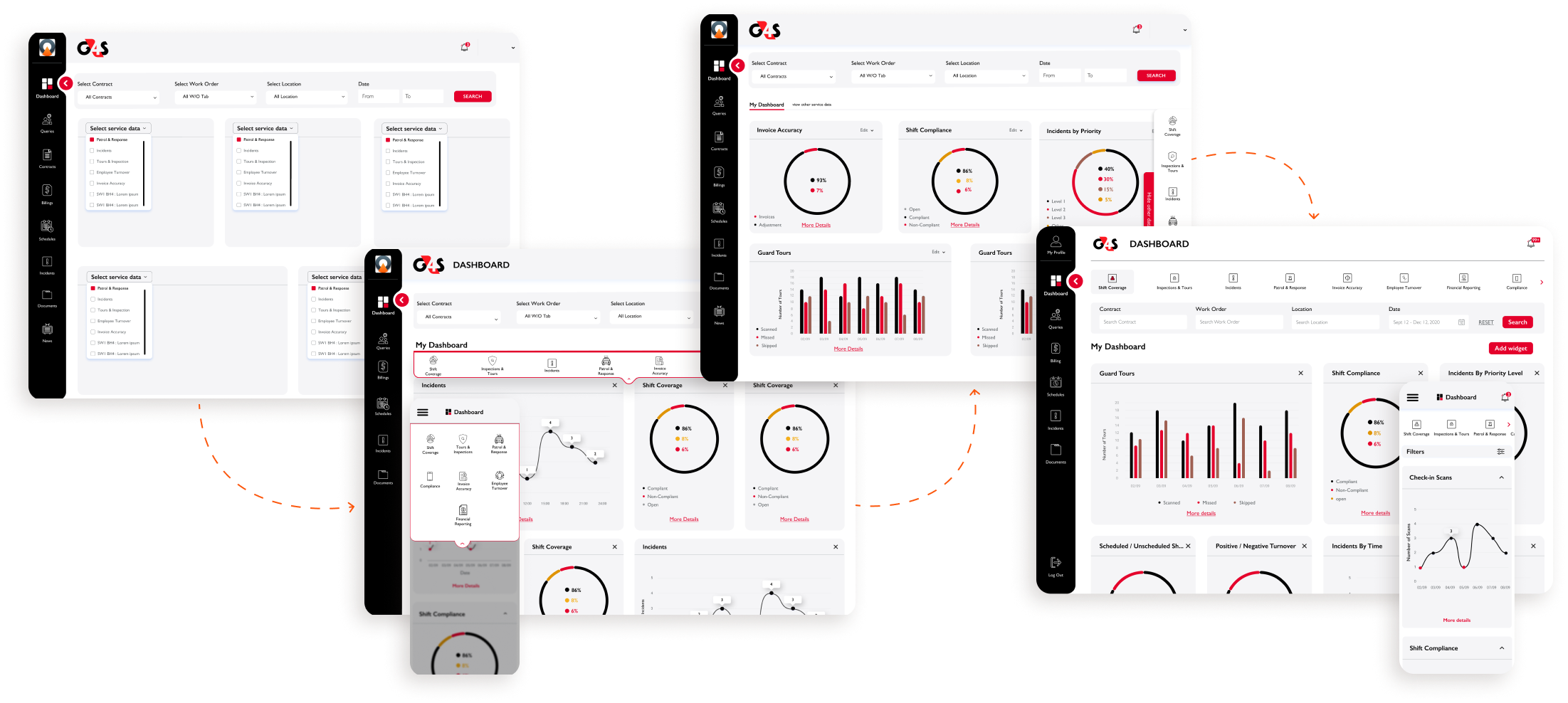
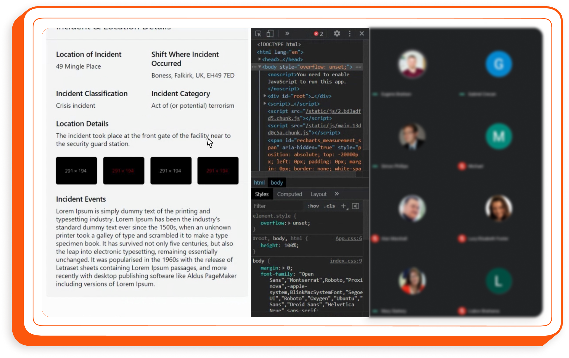
As we developed the custom dashboard design we encountered more issues with the information architecture. Each widget on the dashboard had a page behind it where the user could interrogate the data more thoroughly. However, by giving the user the ability to add and remove widgets accessing those subpages became complex, especially if widgets were removed. Our solution was to create a secondary, fixed navigation on the dashboard itself, but with limited real-estate, especially on mobile, this proved a challenge. However, with plenty of testing we were able to iterate solutions fast.
Final design & handoff
Whilst none of the users we spoke to accessed Javelin via mobile or tablet, it was important to G4S we future proof our designs so they had the flexibility to incorporate more mobile-first features going forward. It was this consideration that caused us so many problems with the information architecture but we succeeded in creating a ‘robust and pleasing user experience’ on desktop, tablet and mobile that satisfied everyone for the MVP.
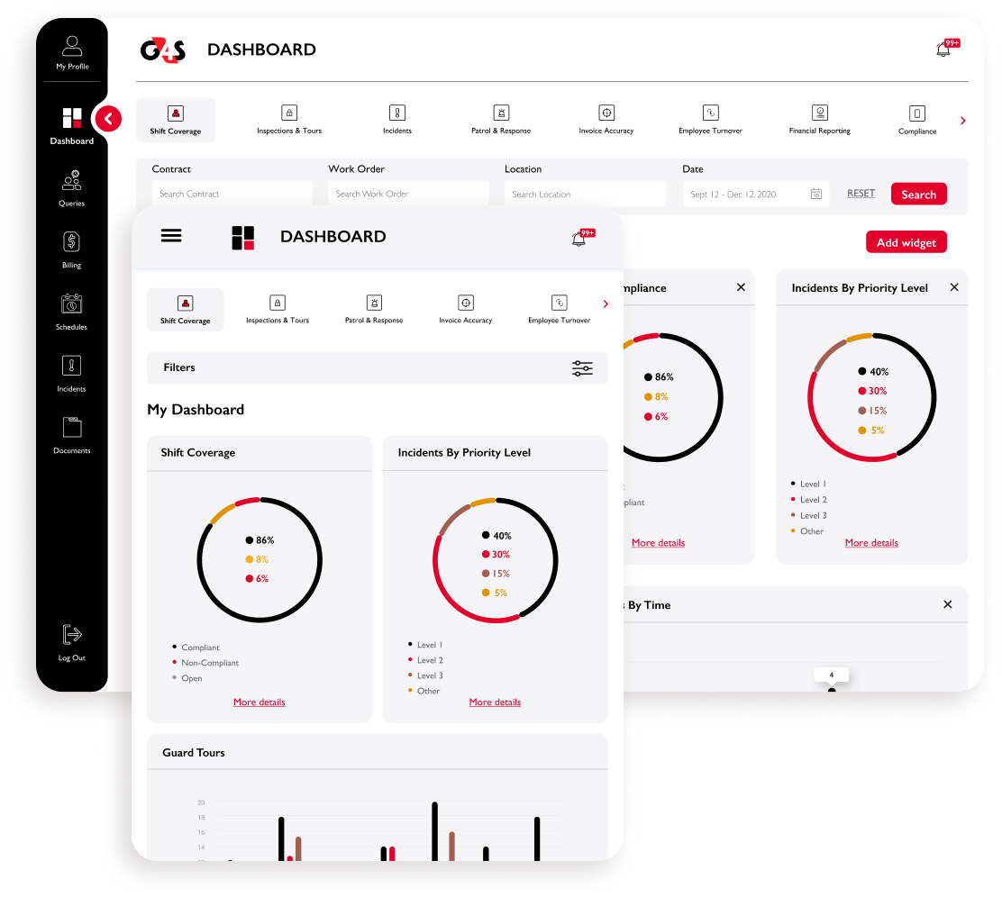
CUSTOMISING THE USERS’ EXPERIENCE
A major annoyance for the users was that the existing dashboard was fixed, and seldom showed useful information. By allowing the user to customise the data they saw, the dashboard was redeemed making it a useful pit-stop before accessing any other features.
GIVING THE USERS MORE DETAIL
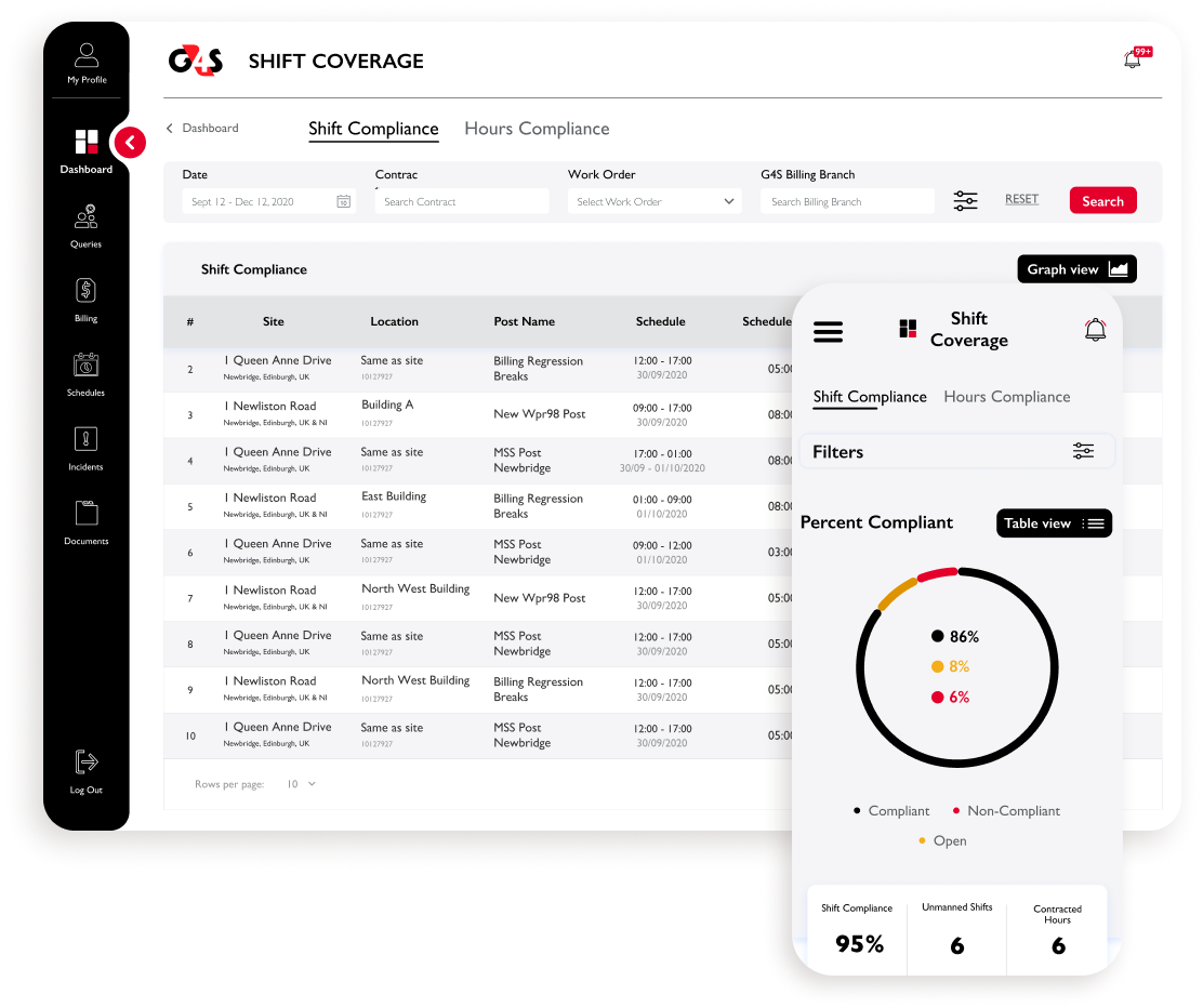
Given that the customer portal is an oversight tool for users to check G4S is hitting their targets, it made the data quite impenetrable. To solve this we totally redesigned the tables, filters and incorporated interactive graphs to make the data accessible, something our users greatly appreciated.
KEEPING THE USERS UP-TO-DATE
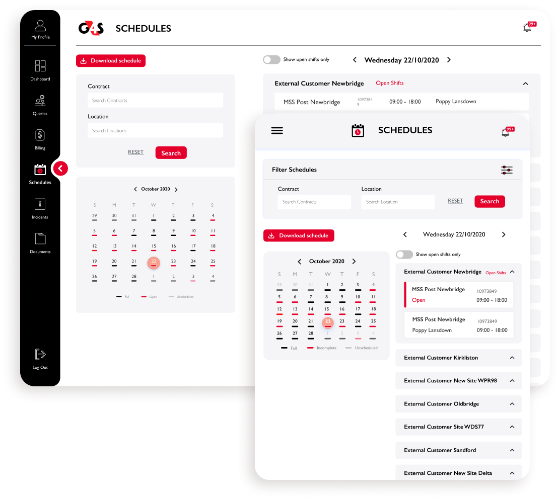
Whilst Schedules was one of the few features that worked, it made finding vacant shifts - its sole purpose for users - very taxing. Our redesign made it as simple as possible to see which dates had ‘open shifts’ and then to filter the locations via a simple toggle, drastically improving the user experience.
GIVING USERS THE TOOLS
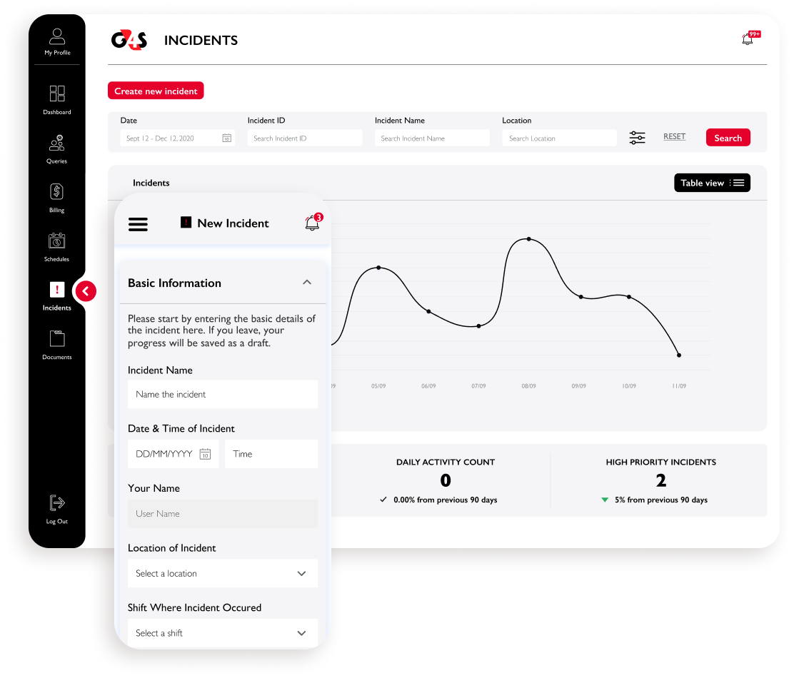
A fairly major feature of the customer portal, the ability to report and track incidents, simply didn’t work. This was essential for managers and heads of security, which is why we tore it down and started from scratch to make it as streamlined as possible.
Handing off to G4s plc
With the designs finished, the client was very happy, not just with the designs but with our rapid turn around and overall responsiveness - as a result, Nemetos picked up several more projects from other teams. With phase 1 to be launched by July 2021 the design team and I are poised for phase 2 and 3, work that should begin in August.
What I learned

1
Overseas teams: To deliver this project we worked with a lot of teams all over the world, from the USA to Ukraine. Coordinating these teams was no small feat and required a lot of forward thinking as well as patience so as to avoid anything getting lost in translation.
2
Too many cooks: Given the sheer number of senior stakeholders we talked to throughout G4S, it became difficult to manage expectations. In the end we learned to just say no to senior C-suite execs wanting to stick their oar in and unintentionally muddy the waters, hampering progress.
3
Educating stakeholders: A significant part of our job was actually to help G4S understand the virtue of research. Initially they wanted solutions up front, however, we demonstrated that would only result in the same old mess they already had and thus got the green-light for research.
4
Bringing balance: G4S had a lot of ideas for new features and whilst they would have been a lot of fun to design, our dialogue with our developers made it clear what was realistic and what wasn’t. Whilst this did limit our scope quite dramatically, it stopped us making some big mistakes.
Want to see more?

CARWOW
BRITISH AIRWAYS


@canrogersdesign 2026
